Attributes and Moodboards
Everything starts with a verbal description of key brand's values and features. It's important to make sure we are on the same page with the client and understand the 'soul' of his business correctly.
To find the right metaphor and visual rhythm for a future identity, we explore hundreds of references. Then we carefully group and filter our findings to create self-explaining mood boards.
To find the right metaphor and visual rhythm for a future identity, we explore hundreds of references. Then we carefully group and filter our findings to create self-explaining mood boards.

Sketches
Sketching is one of the key stages in our branding process. This is a visual exploration and the basis for dialog between our design team and a client. During this stage, we just explore what wows and what works to discover which shape expresses a brand's mood in the best way.

Directions


Color
Once we identified the right shape for the Mobingi logo sign, we started exploring color combinations. To preserve the adeptness from the previous logo and highlight some "tech-coldness," we chose a few blue tones. Transparency is applied to accent the 3d dynamic effect.

Final Results and Style Guide
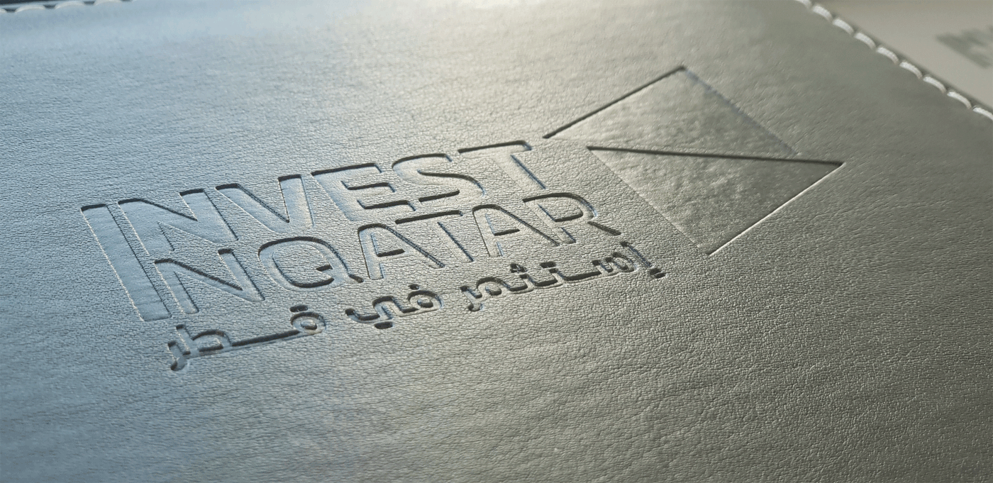
The Invest in Qatar logo sign has an isometric construction, so to make sure that all elements of the brand system work correctly and can be combined, tiled and animated, we used an isometric grid across the brand guide materials.


Brand Pattern

Testing
Good visual identity should give the brand a marketing advantage. The trick is to find the middle ground between a unique look to stand out from in-niche competitors, and the expected visual language in the industry to be defined correctly from the first glance.


Live
At the end of the day, the key challenge happens when a new identity goes alive. There are lots of different places where the logo will be used, so the challenge is to provide the correct assets for a wide variety of materials and contexts. And the ultimate reward is seeing a client proud to use his new logo.